Brand redesign is undoubtedly one of the most difficult marketing disciplines. In order for it to take place properly, it is necessary to properly prepare for it. We prepared one such redesign for our client Papírnictví Pavlík. Our first joint campaign proved that it was successful. But how did it all go and what can you take away from it?
Papírnictví Pavlík is a leading wholesaler of stationery goods with 16 stores throughout the Czech Republic. Since 2013, when it entered the e-commerce space with the establishment of an e-shop, it has offered its customers excellent customer support and an abundance of products online as well. Therefore, before the initial meeting, it was important to do a short audit of the online presentation and prepare. What have we come up with at this stage?
After the first meeting, it was immediately clear where the client felt room for improvement, which is why we organized workshops. In those, we managed to decide the direction in which our work will go. We have divided the subsequent steps to success into three categories.
We never underestimate hard data or build on assumptions. As part of the initial analyses, we combined data from our initial audit, client meetings and other research. We examined the behavior of customers on the website, the structure of the e-shop, the breadth of the assortment and the most frequent questions of clients. So the points of interest, challenges and obstacles became clear goals. We thus began to create a clear and tangible basis for our creative activity.
A high-quality data base from the analyzes helped us to think in context and find a harmonious redesign path. A pleasant bonus was the commitment and authenticity of the owners themselves, who had a very clear idea of their business and the reality of the market. The whole company is based on family tradition, it wants to proudly represent its history and point out the expertise and care it provides to its customers. To determine the direction of communication, we used the tag tree principle, archetype definitions and the STDC framework.
The definition of an archetype was not so clear-cut. The very essence of Pavlík Stationery business is best summed up by the archetype of the Carer. However, the Pavlík family is closer to the Ruler archetype in terms of their expertise and competence. The most natural thing was to find a certain combination. This resulted in a human, capable and stable partner who is not afraid to show his experience, care and always be close.
The right choice of language is the basic connection between the archetype and the target groups. Through it, the brand appeals to the emotions and inner needs of its customers. To ensure that everything is in harmony, we set the tone of communication on three main pillars.
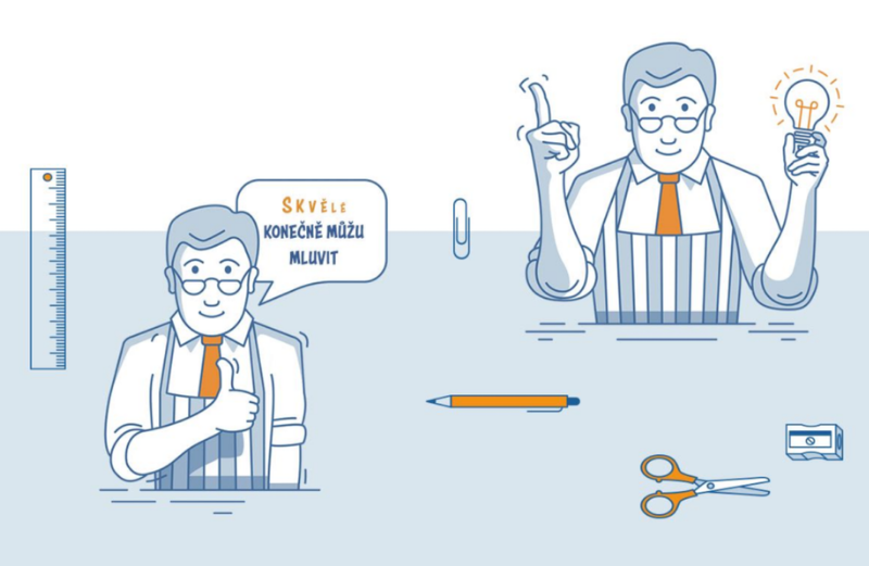
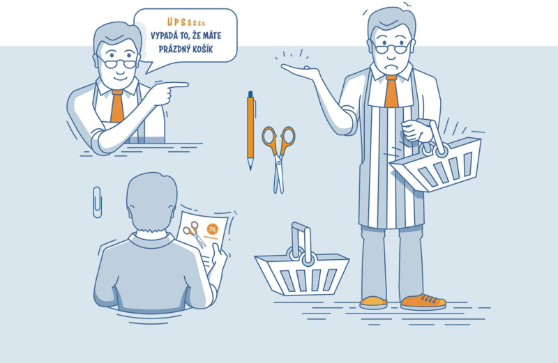
In the era of banner blindness, information overload and the fact that Papírnictví Pavlík had not communicated significantly so far, we started thinking about how to stand out from the crowd. Attention began to turn to the creation of a certain mascot. However, this step is often too much for brand building and not every brand is compatible with a mascot. In the case of the Pavlík family, however, everything happened quite naturally. The mascot in both the marketing and the real world is the owner of Papírnnictví Pavlík himself. He himself strongly represents the story and history of the Pavlík family, he is close to customers and helps them. We chose it because it contains all the company's strong qualities.
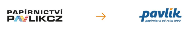
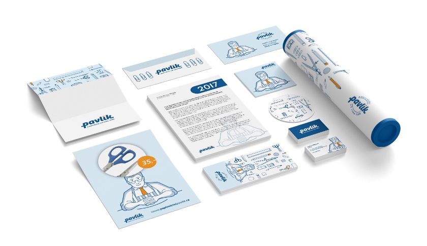
From the idea and communication basics, we had to complete a visual identity that would be original and in line with everything that our client represents. We have prepared a complete visual identity, a new logo, a logo manual.
After the successful rebranding, we launched the first campaign. That was communication during the back to school period. So that the new brand does not fit in with the others, we deliberately chose a polarizing campaign leitmotif: The holidays will end, we will stay.
We prepared packages of graphic banners adapted to each stage and created videos for YouTube and Seznam TV. The campaign took place on two levels:
As we have already forwarded, if you are planning a redesign or just starting a new brand, you need to prepare properly. The more real-world data you gather and the clearer your vision becomes, the more satisfied your business will be with the outcome. Creativity must bring results. And we can do that.